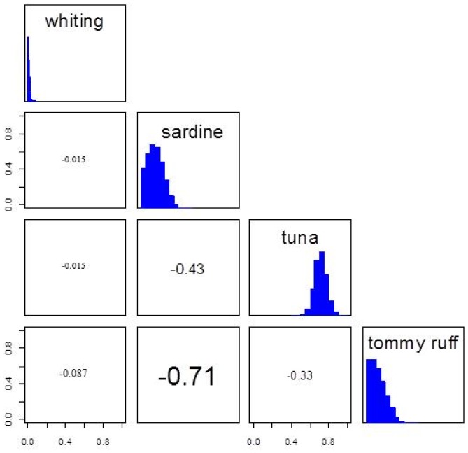
Figure 2. Matrix plot of estimate of each prey proportions calculated in the mixing models from the SIAR package output [30], represented by simulated values of the dietary proportions in the histograms (proportion in both axes).
Correlation values between sources are inside the boxes to the left of histograms, with font size increasing from weak to strong correlation. Well separated sources resulted in weak correlation values (e.g. whiting vs. tuna, −0.015). Sources close to each other resulted in strong correlation (sardine vs. tommy ruff, −0.71). Increased correlation among sources will increase the level of uncertainty in the model output [37].

