
Figure 1.
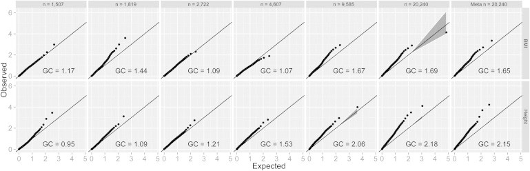
Q-Q Plots of Linkage Analyses
For each cohort (left five panels), as well as the combined data set and the p values from the meta-analysis (the two right-most panels), Q-Q plots were produced for both BMI (top) and height (bottom) to demonstrate overall genomic inflation as being a departure from the expectation (x = y line). 95% confidence intervals are shaded in gray, and GC values for each cell represent genomic inflation. Markers are pruned to be 20 cM apart for reducing correlations between tests (for Q-Q plots on all markers, see Figure S12). From left to right, cohorts are TwinsUK, Netherlands Twin Registry, TWINGENE, Framingham, and QIMR. The sixth panel (n = 20,240) shows the results from the combined analysis, and the seventh panel represents the meta-analysis of all five cohorts.