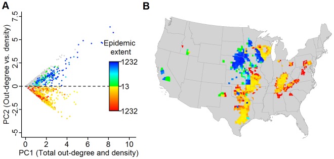
Figure 6. Relative importance of movement vs. local spread determined through a Principal component analysis.

(A) Plot of PC1 (0.7071*Out−degree+0.7071*Premises density) vs. PC2 (0.7071*Out−degree+0.7071*Premises density) for each county. Colored dots represent counties in the upper 20% of simulated epidemic extents with the counties where movement is relatively more important (i.e., PC2 > 0) ranging from green to blue and the counties where density is relatively more important (i.e., PC2 < 0) ranging from yellow to red based on epidemic extent. (B) Map depicting the spatial distribution of the counties within the upper 20% of epidemic extents.
