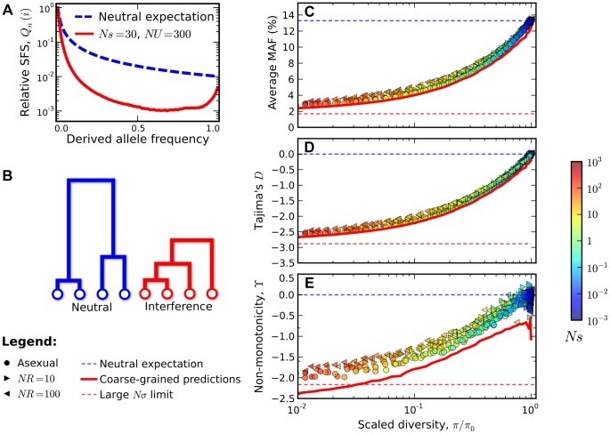
Figure 4. Signatures of pervasive interference selection in the silent site frequency spectrum for a sample of n = 100 individuals.
(A) A typical example of the average site frequency spectrum in the interference selection regime, simulated for Ns = 30, NU = 300, and R≈0 (red line). For comparison, the neutral expectation is given by the dashed blue line. (B) A schematic illustration of the genealogical structure observed in neutral populations (left) and those subject to widespread interference (right). (C) An excess of rare alleles measured by the average minor allele frequency, (D) Tajima's D, and (E) non-monotonic or “U-shaped” behavior at high frequencies measured by  . The statistics in (C–E) are plotted as a function of the reduction in pairwise diversity,
  . Circles denote the subset of simulations in Figure 3 that were classified into the interference selection regime, while the right- and left-pointing triangles depict an analogous set of simulations for recombining genomes with NR = 10 and NR = 100, respectively. All points are colored according to the same scale as Figure 2. For comparison, the solid red lines show the “coarse-grained” predictions (see Methods), while the dashed lines show the corresponding predictions under neutrality (blue) and for the large Nσ limit in Ref. [44] (red).

