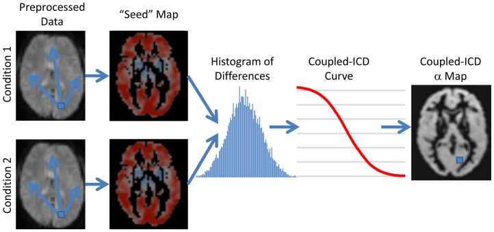
Figure 2. Flow chart describing coupled-ICD.
For data consisting of paired conditions, coupled-ICD jointly analyzes both conditions and then creates a summary of the difference in connectivity between conditions for each voxel. First, a “seed” connectivity map is created for a voxel (shown as the blue square through the flow chart) in each condition. The resulting “seed” maps are then subtracted and a histogram of the differences is computed. The survival function of the distribution of the difference (labeled as coupled-ICD curve) is calculated and modeled with a stretched exponential. This process is repeated for each voxel in the gray matter. The final output is an image where each voxel represents a summary of the difference between two “seed” maps using that voxel as the seed region.

