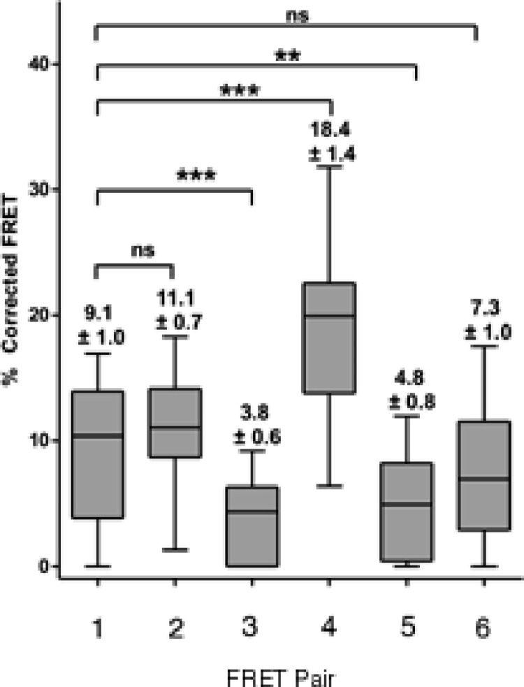
Figure 7. Box and whisker plots depicting population distribution of percentage corrected FRET and showing maximum, minimum, upper and lower quartiles, and sample median.
The individual FRET pairs are shown in the X axis. These are: (1) CFP-C–Atx1 vs YFP-C-Atx1; (2) CFP-C-Atx1 vs YFP-N-Atx1; (3) CFP-567-Atx1 vs YFP-wt-Atx1; (4) CFP-CT2AXH vs YFP-CT2AXH; (5) CFP-AXH vs YFP-AXH; (6) CFP-TLND2AXH vs YFP-TLND2AXH. Means ± standard errors, rounded to one decimal place, are shown above each boxplot. Statistical significance bars are shown and represent results of unpaired t-tests of mean difference = 0 and represent number of individual bleach events pooled from at least 4 individual cells.

