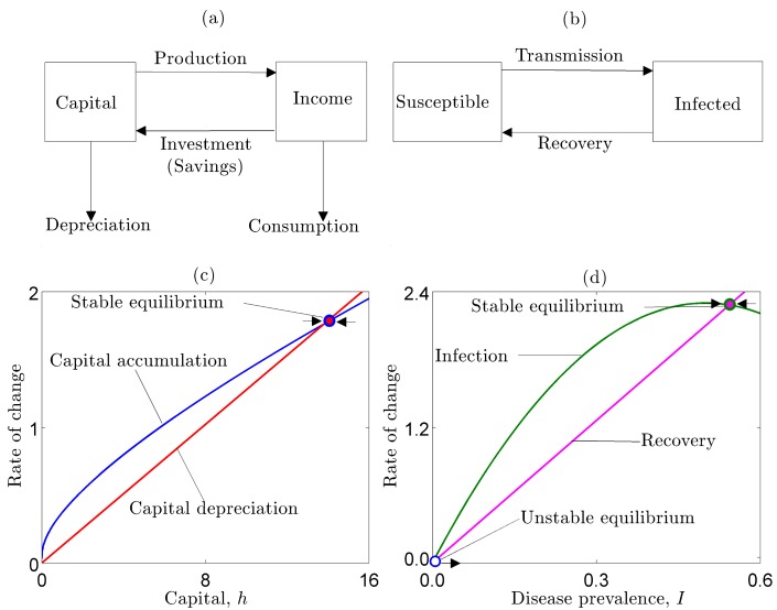
Figure 1. Schematics of (a) the neoclassical growth model, and (b) the SIS epidemic model demonstrate basic similarities in their structure.
In the neoclassical growth model (c), the blue line represents capital accumulation and the red line represents capital depreciation. The steady state level of capital occurs where these curves intersect. In the typical epidemic model (d), the green line represents transmission (i.e., the force of infection) and the pink line represents recovery. The steady state prevalence of disease is where these curves intersect.

