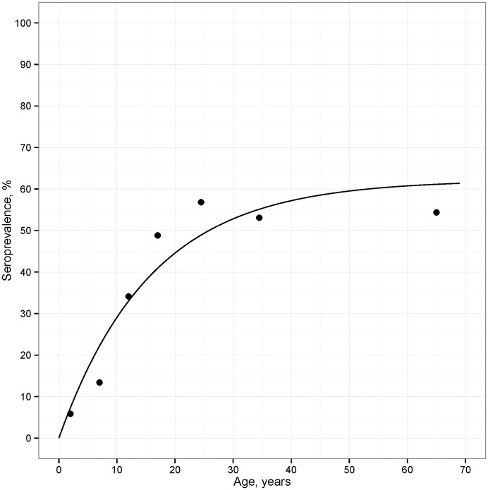
Figure 3. Seroprevalence estimates from the cross-sectional survey in Miton, Haiti, 1998.
Seroprevalence estimates for the age categories in Table 2 (points) are plotted at the midpoint of the age categories, and the line in the plot is the predicted prevalence from the reversible catalytic model.

