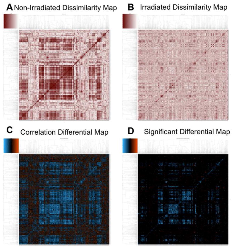
Figure 7.
Correlation based heatmaps created by MetaboLyzer’s correlation analysis workflow. Two dissimilarity heatmaps were created, for both the non-irradiated (A) and irradiated (B) sets. Darker colors in these heatmaps indicate higher absolute Pearson’s correlation values. The heatmap for the non-irradiated set (A) exhibits very distinct patterns and structures, which suggests a highly structured co-regulation of metabolic pathways. However, the heatmap for the irradiated set (B) is far less organized, with many of the patterns seen in the previous map either distorted or missing entirely, suggestive of a widespread disruption of the metabolic pathways as a result of exposure. The differential correlation heatmap (C) essentially combines the two dissimilarity heatmaps in order to reveal differences between the two, with the orange spectrum indicating gain of correlation (with respect to the non-irradiated), and the blue spectrum indicating loss. This heatmap reaffirms observations made with the dissimilarity heatmaps, with the prevalence of blue indicative of a widespread loss of correlation. While indeed there is some gain of correlation observed in the differential correlation heatmap, as indicated by the areas in orange, when only the statistically significant correlation differentials are plotted (D), orange is almost entirely absent. This adds statistical rigor to the notion of widespread loss of correlation structure and therefore disruption of metabolic regulation caused by radiation exposure.

