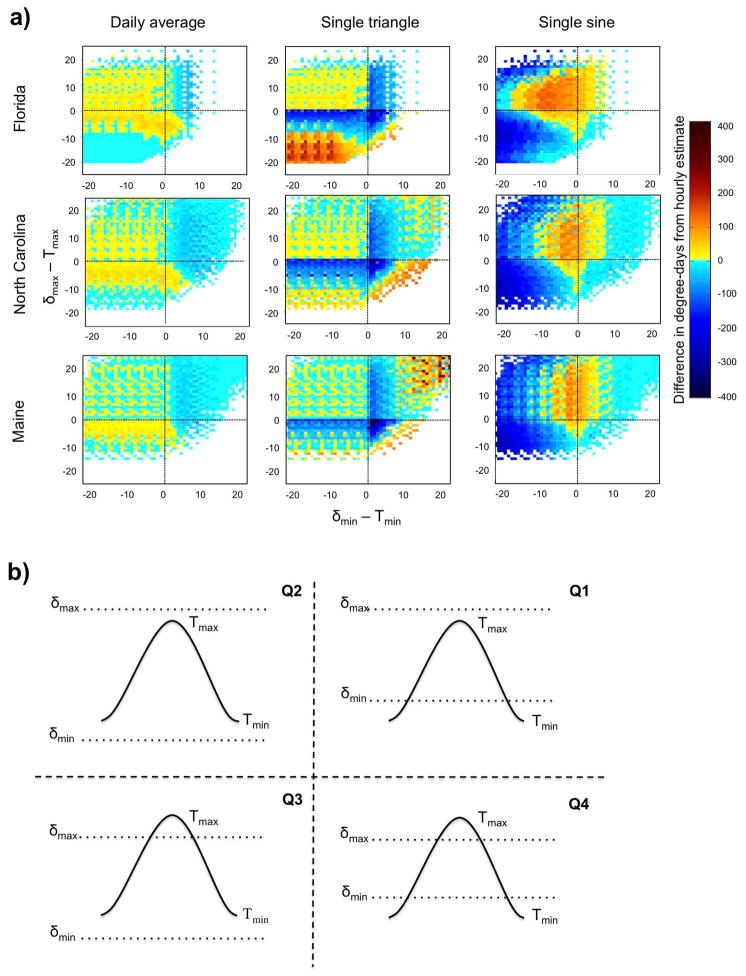
Fig. 5.
Comparison of daily degree-day estimation methods. a) Difference between daily degree-days calculated using hourly data, and daily degree-days estimated from the daily average (first column), single triangle (middle column) and single sine (last column) methods, with red colors indicating an overestimation of the particular method, and blue colors indicating an underestimation. For each plot, the color at every point represents the average difference in degree-days for each day of the time series that meets the specified distance between the minimum and maximum daily temperature (Tmin and Tmax ) and the lower and upper thresholds, respectively, with distances from the lower threshold given along the x-axis, and distances from the upper threshold given along the y-axis. b) Relative positions of the daily minimum and maximum temperatures to the lower and upper thresholds. Each curve represents the temperature cycle for a single day.

