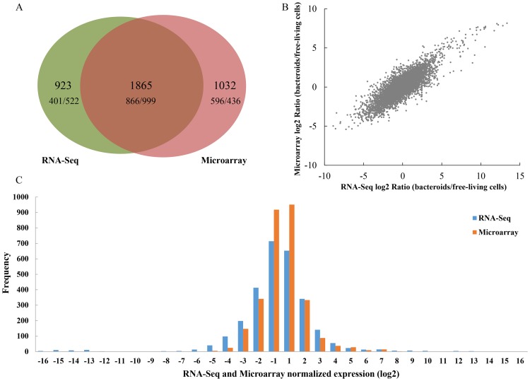
Figure 1. Schematic view of data from RNA-Seq and Microarrays.
A: Venn diagram summarizing the overlap between differentially expressed genes from RNA-Seq (left circle) and Microarrays (right circle). The number of genes called by both methods is indicated by the overlap between the two circles. It also contains the numbers of up/down-regulated genes for each set in the Venn-Diagram. B: Comparison and correlations analyses of differentially expressed genes in RNA-Seq and Microarrays. The plot shows log2 ratios (bacteroids/free-living cells) of expressed genes in RNA-Seq (x axis) and Microarrays (y axis) (7043 genes in total). Pearson's correlation coefficient (r) is indicated for each comparison. C: Distribution of differentially expressed genes detected by RNA-Seq and Microarrays. Genes detected by RNA-Seq are shown with blue bars. Genes detected by Microarrays are shown with orange bars.

