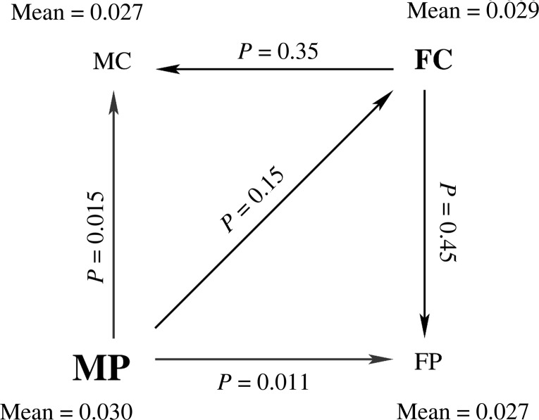
Figure 4.
A graphic illustration of the relationship between the 4 groups (MC, FC, MP, and FP) in terms of the mean SHD value in the region of significant interaction shown in Figure 3. The mean SHD value for each group is indicated next to its name. The prominence of the font is a visual indication of the magnitude of mean SHD in that group. The arrows denote comparisons between groups, such that the arrow points in the direction of decreasing mean SHD. The P-values for each comparison are indicated next to each arrow.

