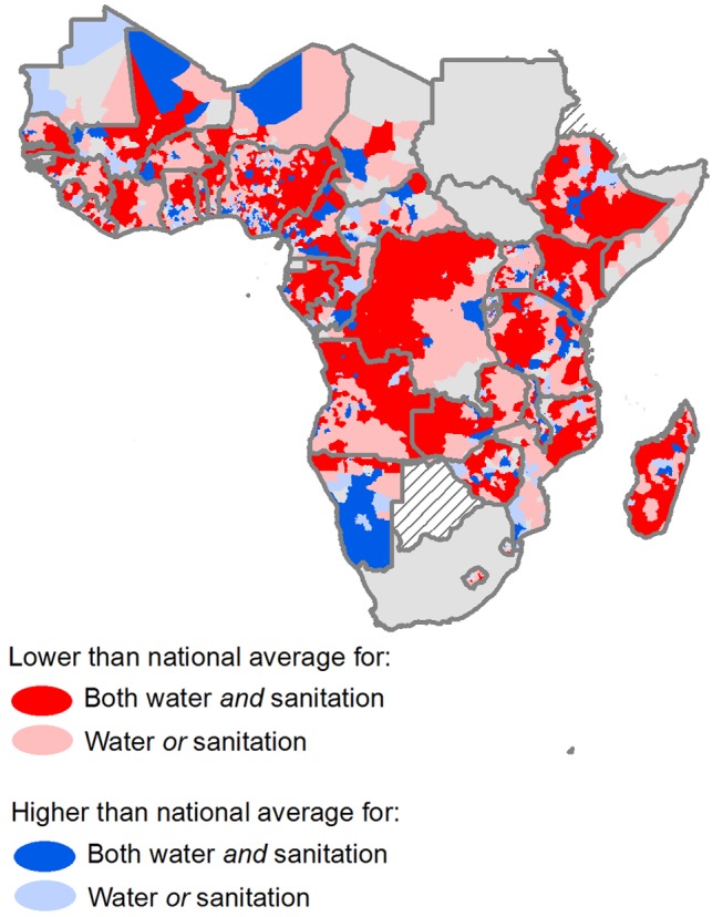
Figure 4. Predicted second administrative areas that differ significantly from national mean coverage.

Second administrative areas shaded red have significantly lower coverage than the national average, based on 95% BCI, for either both (dark red) or one (light red) of improved drinking water and improved sanitation; administrative areas shaded blue have significantly higher coverage rates than the national average. Administrative areas shaded grey are not significantly different from the national mean.
