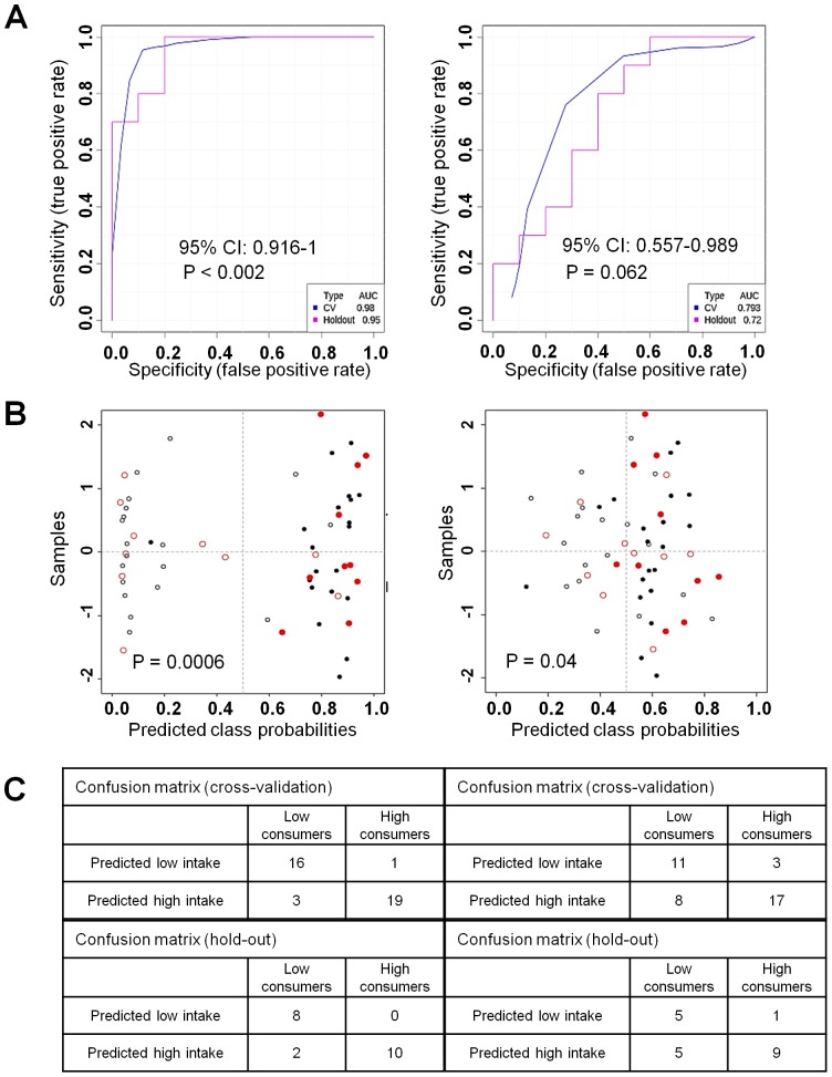
Figure 3. ROC curve analysis of atractyligenin glucuronide and caffeine.
Data for atractyligenin glucuronide are presented in the left-hand column and data for caffeine in the right-hand column. A) Blue curves represent the training set (n = 39 subjects) and pink curves the hold-out set (n = 20 subjects). B) Probabilities of predicted belonging to the high consumer class. Training set, black plots; hold-out set, red plots; filled circles, high consumers; empty circles, low consumers. C) Confusion matrices for the two datasets.

