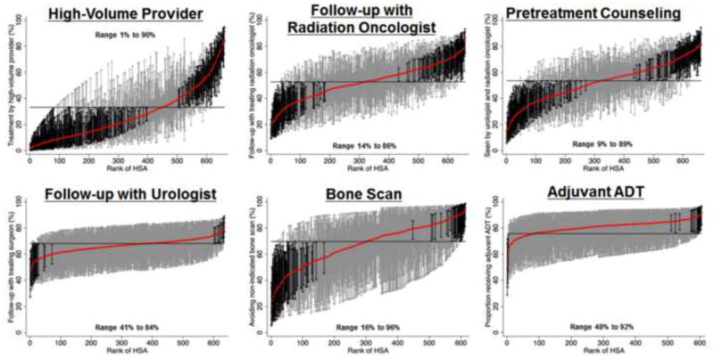
Figure 1.
Variation in quality of prostate cancer care across 661 Hospital Service Areas (HSAs) located within the SEER areas. HSAs were ranked from lowest to highest adherence to each quality measure. The probability of receiving care adherent to each quality measure was calculated by use of hierarchical generalized linear modeling, adjusting for patient and regional characteristics. These models also account for differences in reliability of individual HSA-level adherence rates resulting from variations in the number of patients per HSA. The solid red line represents the adjusted adherence rate for each HSA. The horizontal line represents the adjusted overall mean rate of adherence. Error bars represent 95% confidence intervals for the rates of the individual HSAs. Black error bars represent rates that are statistically significantly different from the overall mean. Grey error bars represent rates that are not significantly different from the overall mean.

