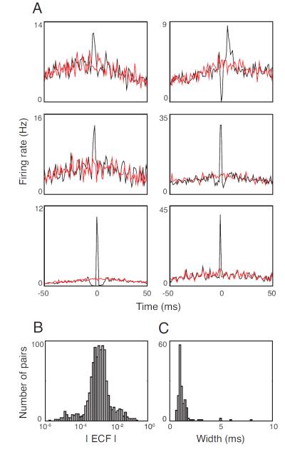
Figure 1. Degree and timescale of correlated activity for pairs of ganglion cells in the mouse retina.
A. Representative cross-correlograms, showing the range of correlation strengths and timescales. As is standard, each plot shows the the firing rate of one cell in the pair relative to the spike times of the cell. Black indicates the raw cross-correlogram; red indicates the shift-predictor (Perkel, Gerstein, and Moore 1967). The difference between these two is the noise correlation, the focus of this paper. B. Distribution of ECFs for all cell pairs in the dataset (n=567 pairs, 3 retinas). C. Distribution of half-widths of the central peak of the cross-correlogram for all cell pairs with ECFs > 0.5% in the dataset (n=157, 3 retinas).

