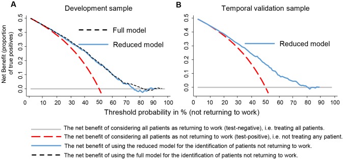
Figure 3. Decision curve analysis.
Decision curve analysis of the Full Model (dashed line black line) and Reduced Model (blue solid line) in the development sample (Panel A) and the Reduced Model in the temporal validation sample (Panel B). The y-Axis represents the net benefit, which is the probability of true positives minus the probability of false-positives weighted for the threshold probability. With threshold probability (or risk thresholds) we mean the threshold above which a patient is declared at risk to not return to work at two years. The dashed red curve shows net benefit of considering all patients as positive (i.e. classified as being not returning to work). The benefit of considering all patients as returning to work was set as reference (solid grey horizontal line). In the left Panel (A) we see that the net benefits for both models are quite similar. The Full Modell would show advantages if a threshold would be set between 15% to 82%. The right Panel (B) shows that that the net benefit in the temporal validation sample is only little lower than in the development sample. Clear benefits are seen from risks thresholds from about 20 to 75%. The net benefit is calculated as (proportion of true positives) – (proportion of false positives)*pt/(1−pt), where pt is the threshold probability.

