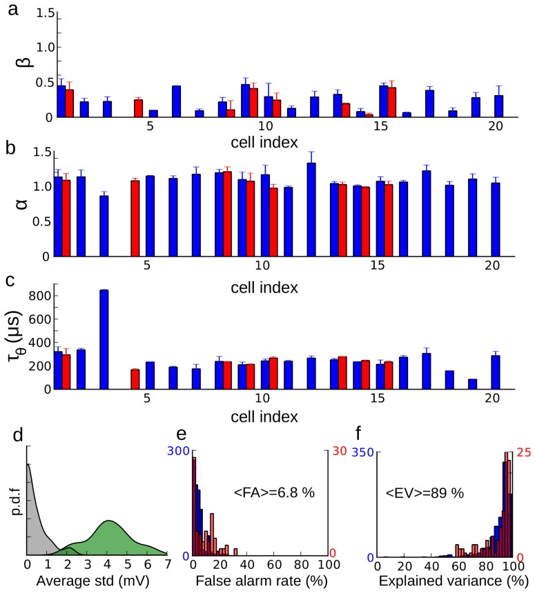
Figure 6. Fitting results.
The optimization results for all cells are shown for three parameters: high voltage slope  (a), low voltage slope
  (b) and time constant
  (c). Blue bars correspond to mean ± standard deviation over all recordings categorized by average membrane potential, and red bars (when available) correspond to mean ± standard deviation over all recordings categorized by stimulus condition (e.g. varying ITD with fixed IID). d, Distribution of average distance within cells between steady-state threshold functions (grey) and between steady-state threshold functions and the diagonal (green). e, Distribution of false alarm rates when the models are tested against recordings with a different mean
  (blue) and with different sound stimulation (red) than used for fitting. f, Same as (d) for the explained variance of measured spike threshold.

