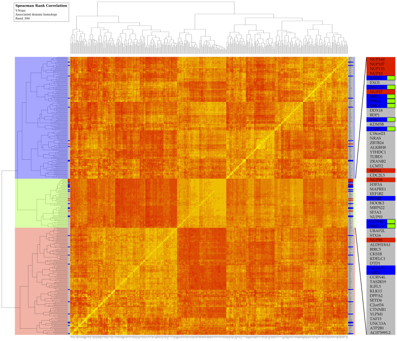
Figure 4. Clustering of human gene expression patterns across multiple tissues and cell lines.
Gene expression affinities are represented in a heat map by Spearman rank correlation coefficients as similarity measure across tissues and cell lines (see Methods). The narrow strip on both sides of the map indicates the entries corresponding to Y-Nups (red), homologs of associated domains (blue) – including human paralogs (Supplementary Table 3) found in other species (Supplementary Table 2), and a randomly selected set of 300 genes (grey); see also Methods. By splitting the clustering dendrogram at the second bifurcation, three clusters emerge depicted by three major blocks (color-coded, left side). The middle block (light green) is enriched in Y-Nups except SEC13, the upper cluster (light blue) contains SEC13, while the lower cluster (light red) does not contain any known Y-Nups. The inset (right side) magnifies entries in the middle block, where Y-Nups are included: gene names are shown, color scheme as for entire strip; green labels signify genes encoding for Y-Nup associated domains, supported by the bootstrap analysis (Supplementary Table 3). This figure is available at higher resolution as Supplementary Figure 6.

