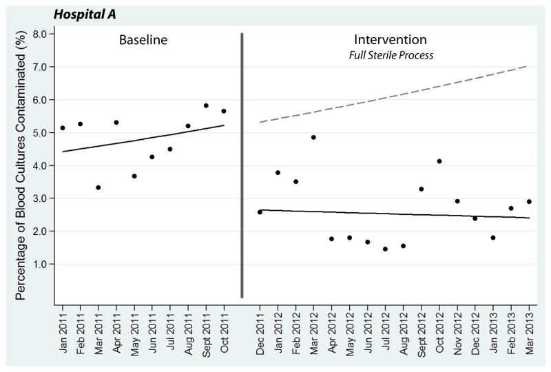
Figure 3.
Segmented regression analysis of blood culture contamination at Hospital A. Each data point represents the percentage of blood cultures contaminated during a single month. The transition phase in November 2011 is denoted by a vertical line. Solid lines represent best-fit linear regression lines, while the dotted line is the baseline regression line projected into the intervention period.

