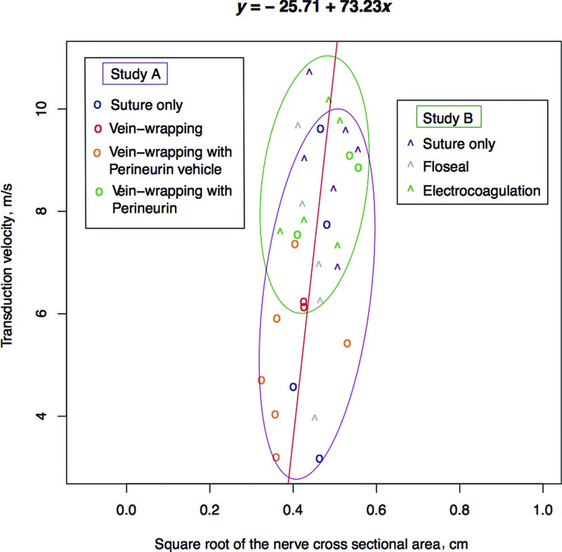
Figure 2.

Fitted linear model (red line, y = −25.71 + 73.23x) after regression analysis between the square root of the cross-sectional area of the nerve and the transduction velocity. Data originating from study A are depicted by “o” and data originating from study B by “ˆ.” The different colors present the different treatments, as described in the legends. Magenta ellipse includes all measurements originating from study A, while green ellipse includes all measurements but one originating from study B.
