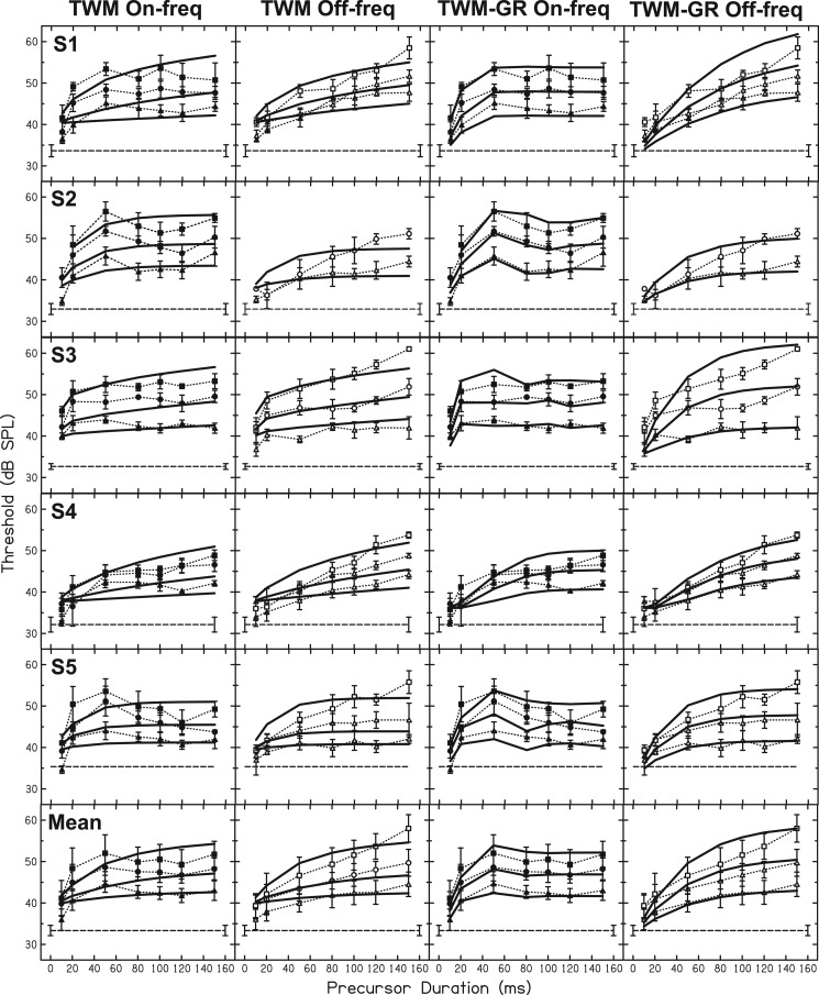
Figure 4.
TWM fits (first and second columns) and TWM-GR fits (third and fourth columns) are shown as solid lines for all data. On-frequency precursor data are plotted as filled symbols and dotted lines in the first column and again in the third column. Off-frequency precursor data are plotted as open symbols and dotted lines in the second and fourth columns. The different symbols represent precursor level (see Fig. 2). As in Fig. 2, the horizontal dashed line in each panel is threshold with the fixed masker and control precursor.

