
Figure 2.
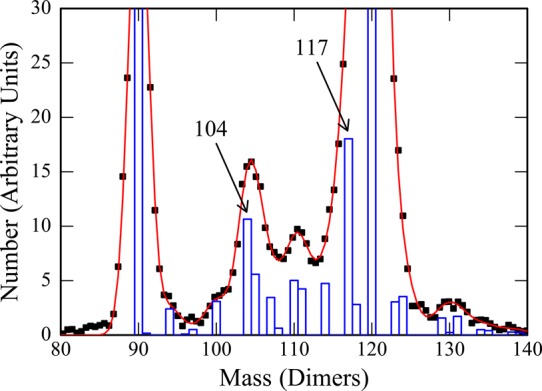
Analysis of the CDMS mass spectrum in Figure 1. The points are the measured mass spectrum and the red curve is a least-squares fit to the points using the model described in the text. The blue histogram shows the intensities of the intermediates that provide the best fit to the measured spectrum. The mass scale is in terms of the number of dimers.