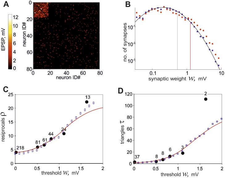
Figure 2. The properties of the network generated by the developed algorithm.
A, An example of connectivity matrix for 80 excitatory neurons containing a single cluster is shown. The weight of each connection is presented in pseudo color. B, The probability density of nonzero weights distribution is shown in logarithmic scales. Black circles show the weight distribution obtained for the entire network and red circles show the distribution inside the cluster. Solid curve represents a lognormal fit to the data points, black vertical line corresponds to the mean weight of connections for the entire network and red line corresponds to the mean weight inside the cluster. C, The coefficients of the overrepresentation of reciprocal connections ρ versus threshold value w are shown. Blue squares are obtained in the model network and black circles are taken from the experimental data shown in ref. [10], where each number shows the number of the corresponding connections obtained by experiment. Red line is calculated by formula (7) for the parameter choice of K = 1. D, The coefficients of the overrepresentation of triangles τ(w) are shown. Symbols are used in the same manner as in the previous plot.

