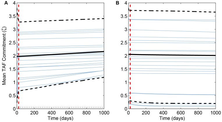
Figure 6. Change over time in weighted mean angiogenesis effort,  .
.
Blue curves in both panels represent the first 20 of 1000 simulations plotted in Fig. 5. Solid black curves are ensemble averages of all 1000 runs, dashed black curves are the inner 95th percentile of all runs, and dashed red lines are mean time of the last mutation. (Compare Fig. 3.) (A)  min−1; dotted horizontal line is the ESS from adaptive dynamics (
 min−1). (B)
  min−1; the ESS value of
  min−1 is not shown.

