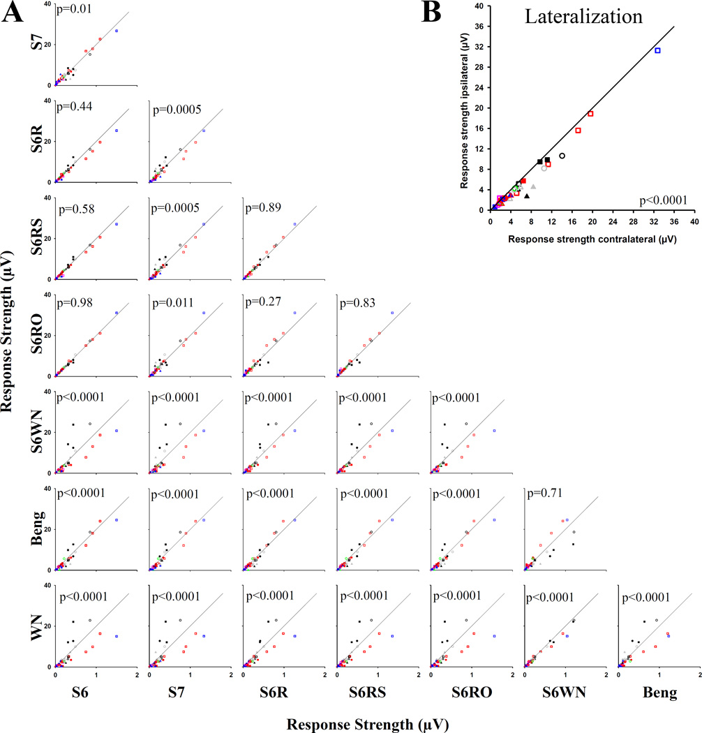
Figure 4.
A. Pairwise comparisons between responses to the different stimuli in the MixAcoustic condition. In each graph, the diagonal represents the line of no difference. If a point falls on one side of the line, then the response to that stimulus is stronger than the response to the other stimulus for the site represented by that point. Different symbols represent the different birds, as in Figure 2. Abbreviations: S6, zebra finch song 6; S7, zebra finch song 7; S6R, zebra finch song 6 played in reverse; S6RS, zebra finch song 6 with the syllables played in reverse, but in the correct order; S6RO, zebra finch song 6 with the syllables played normally, but in reverse order; S6WN, white noise, amplitude modulated with the amplitude envelope of zebra finch song 6; Beng, Bengalese finch song; WN, white noise burst. B. Response strength to auditory stimulation coming from the side of the head ipsilateral to the implant plotted against the response strength to auditory stimulation coming from the contralateral side of the head. Each point represents one recording site, and the data are from the HabLocation condition (n= 6 birds, symbols). The p-values in the graphs represents the pairwise comparisons for each site individually, combined using Stouffer’s Z-test (see Material and Methods). The colors indicate the brain area from which the data were recorded: blue: NCM; grey: L3; black: L2; green: L1; red: CM; pink: CSt.

