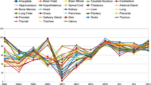
Figure 1.
Data retrieved from the dataset records GDS596 and GDS1096 of NCBI-GEO database. The figure depicts the dynamin expression profiles of several normal human organs or tissues. The dynamin genes are listed on the x-axis, while, the relative gene expression is shown on the y-axis. The points represent the gene expression level (presented as a percentatge). Each point represents the mean of the gene expression level in normal organ or tissue samples that were common to both of the independent experimental datasets (GDS596 and GDS1096) of the NCBI-GEO database. According to the NCBI-GEO data analysis, all values within an array are rank ordered and then placed into percentile ‘bins’. In other words, all the values of one hybridisation are sorted and then split into 100 groups. Thus, the points give an indication of where the expression of a given gene falls with respect to all genes on that array. In these records, the platform GPL96 (Affymetrix Human Genome U133A Array) were used, that includes over 1,000,000 unique oligonucleotide features covering more than 39,000 transcript variants, which in turn represent more than 33,000 of the best characterised human genes. See Table 1 for a detailed specification of the data.

