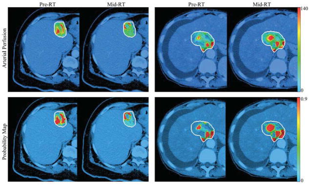
Figure 3.

Examples of hepatic arterial perfusion maps (first row) and probability maps (second row) of a responsive tumor (first two columns) and a progressive tumor (last two columns) at pre-RT and mid-RT. The maps were overlapped on treatment planning CT using the colorbars of perfusion (first row) and probability (second row). The white curves contoured the gross tumor volumes.
