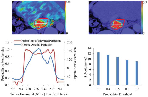
Figure 4.

An example of a color-coded arterial perfusion map (left top), corresponding probability map of the red curve-contoured tumor (top right), a plot of the probabilities and perfusion values along a horizontal (white) line placed in the tumor (left bottom), and a plot of the tumor subvolumes at different probability thresholds (right bottom). Note that the physical subvolume is insensitive to the probability threshold values between 0.3 and 0.7.
