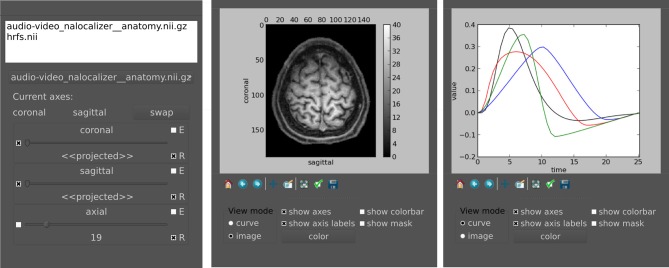
Figure 5.
Main widget components of pyhrf_view to browse and view n-dimensional data. Left: The list widget on top displays the currently loaded objects. The slicer panel at the bottom allows: projection of axes (combo boxes on the left), domain value slicing (sliders in the middle) and definition of view synchronization (combo boxes on the right). For a given axis slicer, the two combo boxes defining synchronization are: (E) toggle emission of slice change to other slicers, (R) toggle reception from other slicers or from click events on plots. Middle: Plot window for the current selected slice. The top part displays the actual plot as produced by matplolib.pylab. The bottom part offers changing the view mode (either curve, image, or histogram), and toggling display of axes, colorbar and mask. The color button pops up a gradient map selector if in image mode or a color picker if in curve mode. Right: Other plot window to illustrate curve display.

