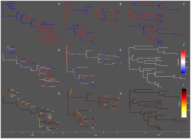
Figure 5. Genealogies simulated under different mixing rates.
Mixing rates between the red and blue population were varied from low ( ), medium (
 ) to high (
 ). (A–C) The true lineage states mapped onto the genealogy. (D–F) Lineage state probabilities given with respect to the probability that the lineage is in the red state. (G–I) Entropy in the lineage states, which shows how much uncertainty there is in the lineage states. For each lineage
  , the entropy
  .
.

