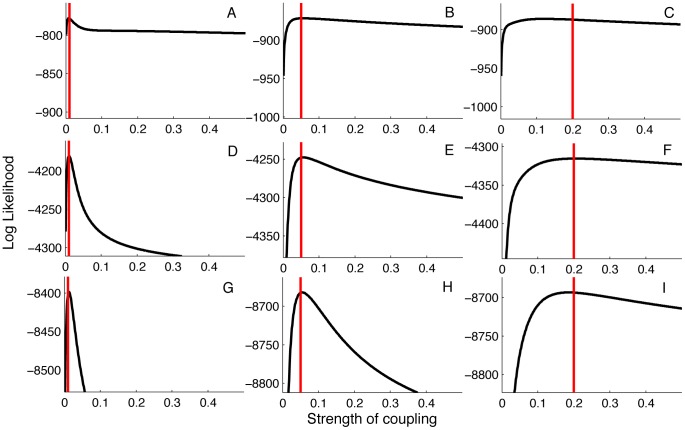
Figure 6. Likelihood profiles for the strength of coupling  obtained from genealogies simulated under different values of
  .
.
Red lines correspond to the true value of  . The likelihoods were computed from genealogies with 100 samples in (A–C), 500 samples in (D–F) and 1000 samples in (G–I). These sample sizes correspond, respectively, to approximately 0.2%, 1.0% and 2% of all infected individuals being sampled.

