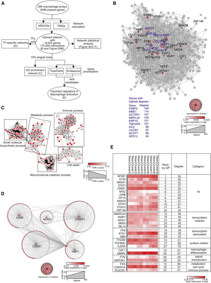
Figure 6.
Macrophage Activation Network Calculated by ARACNe
(A) Schema describing the workflow for Figure 6.
(B) Visualization of the 10% largest hub genes of the ARACNe predicted macrophage regulatory network (n = 299 transcriptomes). For the top ten genes (highest degree of connectivity, blue) and TFs, mean expression values (log2, derived from the ten clusters in Figure 1I) are highlighted in red colors. Node size reflects degree of connectivity.
(C) Network visualization of GOEA using BiNGO and EnrichmentMap on hubs shown in (B). Red nodes represent enriched GO-terms, and node size represent FDR-adjusted enrichment p value (q value). Edge thickness represents overlap of genes between neighbor nodes.
(D) Subnetworks of the five most highly expressed TFs from all hubs shown in (B). First neighbors are surrounding corresponding TFs. Each gene is multicolored according to its mean expression (log2) in ten clusters (from Figure 1I).
(E) Top 30 putative candidates after Gene Prioritization (GP) of 869 hubs. Mean expression (log2) from each cluster is displayed as a heatmap. Categorization is according to cellular functions. See also Figures S4 and S5 and Table S3.

