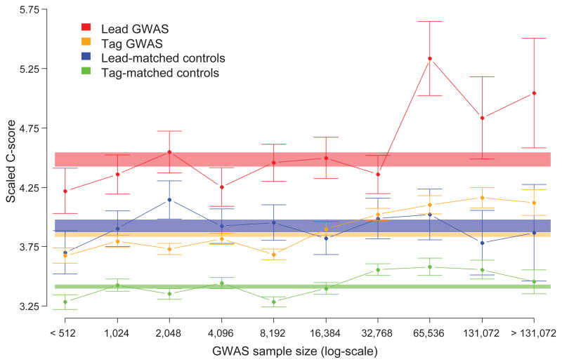
Figure 5.
C-scores for GWAS SNPs are higher than nearby control SNPs and dependent on study sample size. The average scaled C-score (y-axis) is plotted for each category of SNP, as indicated by color, relative to the sample sizes of the association studies in which the SNPs were identified (x-axis). Sample size bins are log2-scaled and mutually exclusive; for example, the bin labeled “1024” represents all SNPs from studies with between 512 and 1024 samples. Error bars are ±1 standard errors of the mean (SEM). Shaded rectangles represent the overall, i.e. across all sample sizes, scaled C-score means ±1 SEM for each category as indicated by the color.

