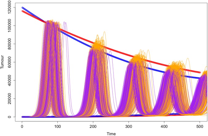
Figure 12. Illustration of the regression models fit for the sequences of the local maxima and local minima for the two different simulation techniques.
The Gillespie simulations are plotted in purple with the mixed effect models plotted in blue. The ABMS simulation runs are plotted in orange with the mixed effect models plotted in red.

