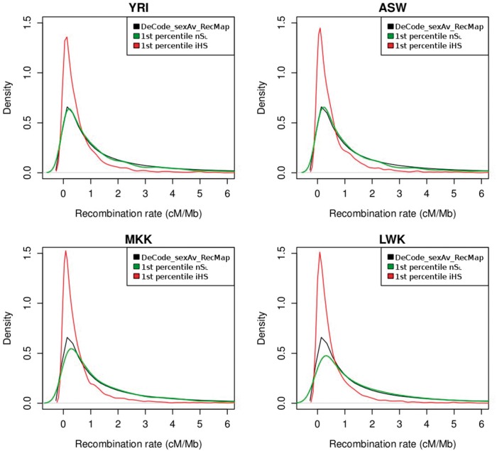
Fig. 4.
Distribution of the recombination rate. Distribution of recombination rate for nSL and iHS outliers (less than the first percentile of the respective empirical distributions). Recombination rate for nSL outliers is shown in green, whereas recombination rate for the iHS outliers is in red. The distribution of the recombination rates for the entire genome is shown in black (data taken from the DeCode recombination map). Each panel in the figure corresponds to one HapMap3 population of African ancestry (YRI, ASW, MKK, and LWK).

