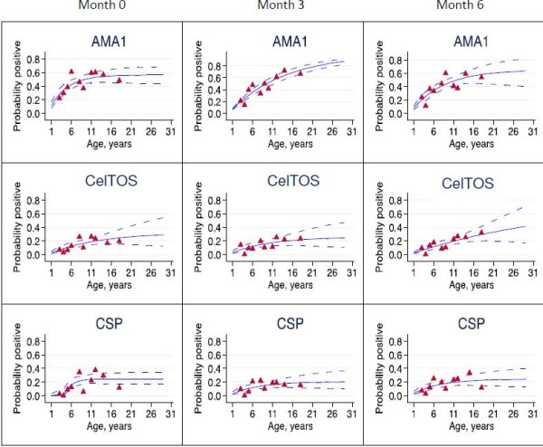
Figure 3.

Seroprevalence curves for all Plasmodium falciparum antigens at each cross-section. Seroprevalence curves represent the rate at which individuals become seropositive to specific antigens. In each graph, points represent age seroprevalence (divided into deciles), unbroken lines represent maximum likelihood curves and broken lines represent 95% confidence intervals.
