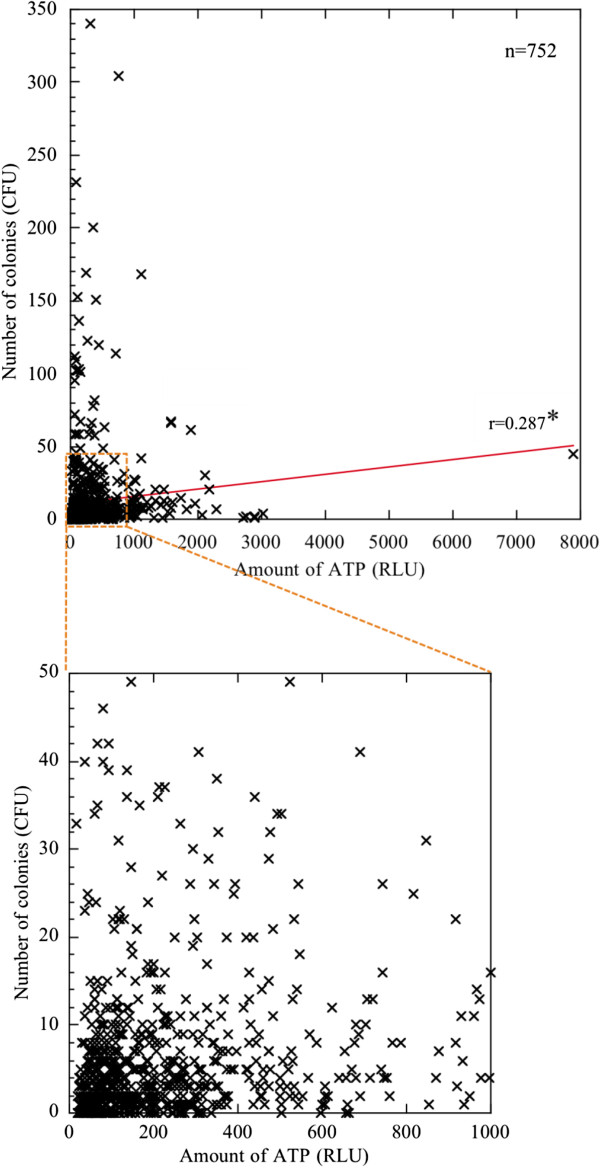
Figure 6.
Correlation between ATP values and stamp values estimated on all 752 hospital surfaces. The x axis shows the amount of ATP (RLU) estimated by the ATP method, and the y axis shows the CFU estimated by the stamp method. The red line is the correlation line. The small dashed square is enlarged in the lower panel. r, Spearman’s correlation index. *p < 0.05 (showing minimal statistical significance).

