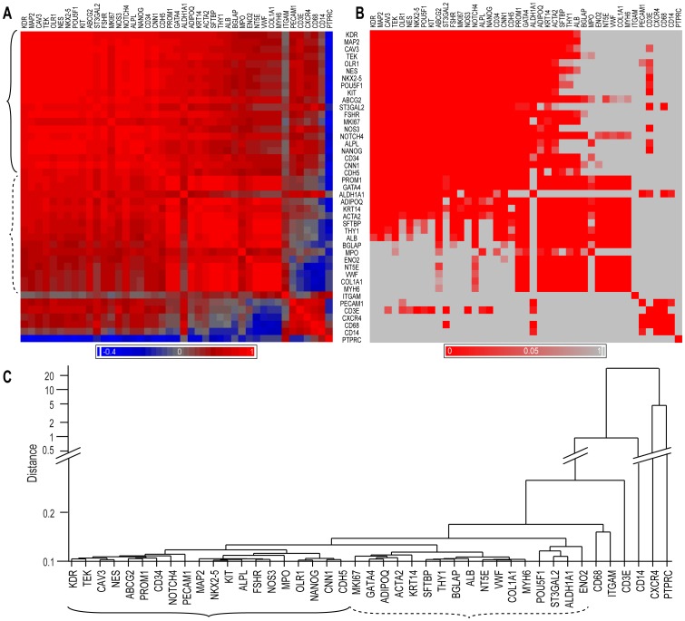
Figure 3. Correlation and clustering analysis of data.
A. A heat map of the bivariate correlation matrix of gene expression levels representing Pearson's correlation coefficient, r, in descending order, beginning with KDR/VEGFR2 (red: positive correlation; blue: negative correlation; gray: no correlation). B. The corresponding probability values, p, after Bonferroni correction (red: p<0.05; gray: not significant). C. An unsupervised hierarchical clustering analysis (complete linkage on standardized data) representing the associations between the genes as distances (Y-axis). In A and C, the corresponding main gene groups are indicated by brackets.

