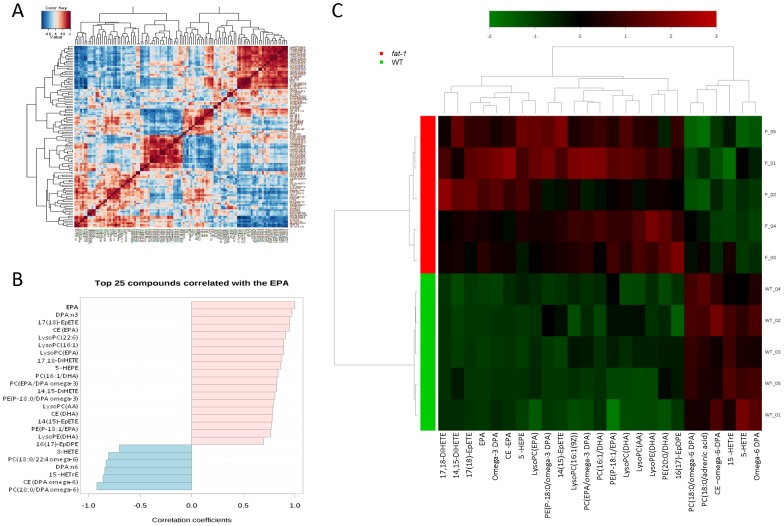
Figure 5. Lipidomic biosignature of fat-1 mice.
A, Correlation analysis was used to visualize the overall relationships between different features and (B) to identify which features are correlated with EPA. C, Clustering result shown as heatmap (distance measure using Pearson, and clustering algorithm using ward), providing an intuitive visualization of the characteristic lipidomic biosignature found in fat-1 mice versus WT mice. Each colored cell on the map corresponds to a concentration value, with samples in rows and features/compounds in columns. Displayed are the top 25 lipids ranked by t-tests.

