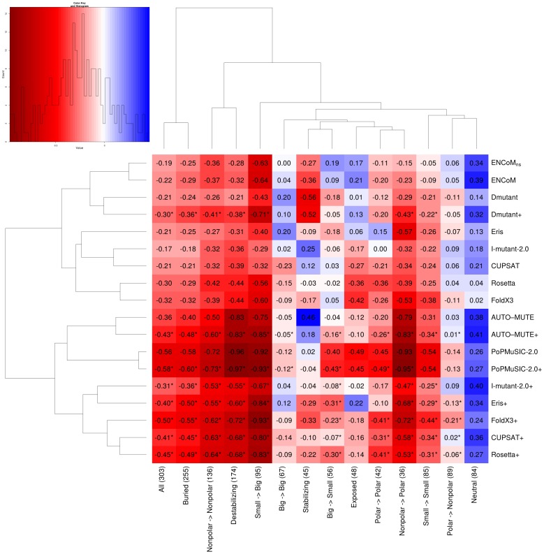
Figure 8. Average RMSE differences for different types of mutations, prediction methods and their combinations with ENCoM.
We calculate the RMSE difference (Eq. 8) for different subsets of the data (columns) and different methods (rows). Methods followed by a ‘+’ denote linear combinations of the named method with ENCoM. The heatmap values (shown within cells) denote the bootstrapped (10000 iterations) average RMSE difference with respect to random and are color coded according to the map on the upper left (lower values in red signify better predictions). For example the values in the leftmost column representing all data comes from the subtraction of the averages in the corresponding box plots in Figure 4 for the non-combined methods and the random model. Different subsets of types of mutations are show according to certain properties of the amino-acids or residues involved: buried (less than 30% solvent-exposed surface area) or exposed (otherwise), small (A,N,D,C, G, P,S, and V) or big (otherwise), polar (R,N,D,E,Q,H,K,S,T and Y) or non-polar including hydrophobic and aromatic (otherwise). Both methods and subsets of the data are clustered according to similarities in the RMSE difference profiles. Cases where the combination of a method with ENCoM is beneficial, i.e., the RMSE difference is lower than either method in isolation are denoted by a ‘*’ next to their values within the cell.

