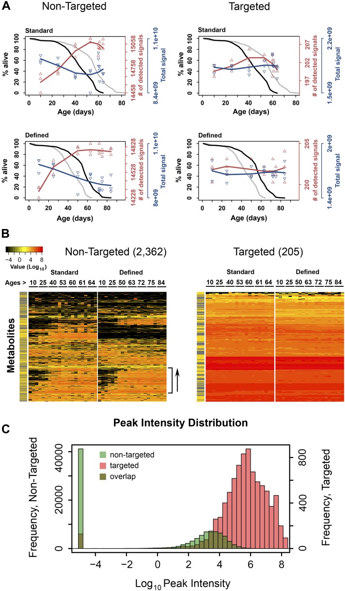
Figure 1. Dynamics of metabolite diversity throughout lifespan.
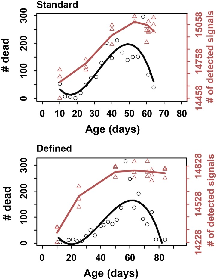
(A) The number of detected nontargeted metabolites rises and then levels off as a function of cohort's age. Age-dependent changes in the number of detected metabolites (red curve) and intensity of total signal (blue curve) for nontargeted (two left panels) and targeted (two right panels) metabolites for standard (two upper panels) and defined (two lower panels) diets are shown. The lines were drawn using cubic polynomial fit function. Triangles mark data for the separately collected replicates for each age group. Significance for age-associated pattern in metabolite diversity was established using repeated measures ANOVA and was significant for nontargeted metabolites (p<6 × 10⁻⁶) but not significant for targeted metabolites (p>0.2). The corresponding lifespan curves are shown in black in each panel, and the curves in grey (for the other diet) are shown for convenient comparison of survivorship on the two diets. Mean lifespan of flies on standard and defined diets was 50.8 and 64.4 days, respectively (log-rank test [p<0.001]). (B) Metabolites which registered at zero in at least one sample (21 total samples [three associated replicates for each of the 7 age groups]) were isolated from the dataset and, for visualization purposes, non-detected signals (ones registering at 0) were changed to 1 × 10⁻⁵ and Log10 transformed with the remaining signals. Accordingly, points of non-detection in black along with the color gradient of the mass-spectrometry peak intensities for detected signals are provided on two age-supervised hierarchically clustered heatmap images. For comparison purposes, only metabolites overlapping in both dietary regimens were used. Side bracket exemplifies rises in age-associated metabolites. Side bars highlight metabolites from the lipid fraction (yellow). Other metabolites are shown in black in this bar. (C) Histograms show overlaps in the distribution of signal intensities for all nontargeted metabolites vs targeted metabolites used to construct heat map images in B.


