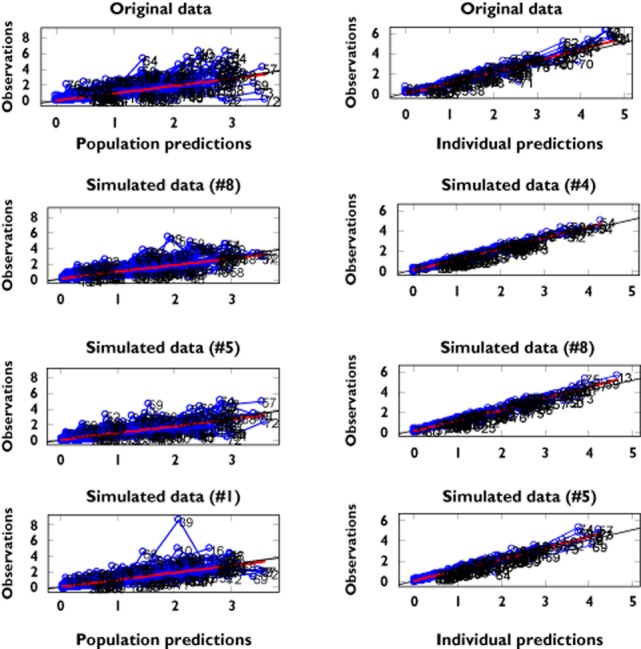
Figure 2.

Mirror plots. Each panel shows the goodness of fit for the original data set (first on the top) and three randomly selected simulated data sets. On the left panel the mirror plots depict population predictions vs. observations. On the right panel the mirror plots depict individual predictions vs. observations
