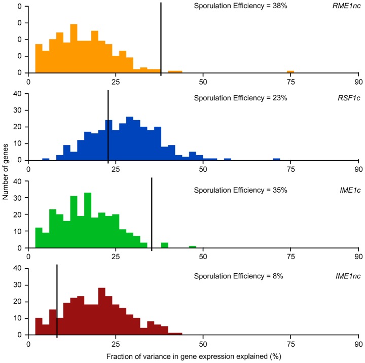
Figure 4. Histogram of total fraction (%) of gene expression variance explained by each QTN.
For each QTN, total fraction of gene expression variance explained (x-axis) is calculated by the sum of the significant main and interaction terms. The number of significant gene expression models with the given fraction is plotted on the y-axis. Only the significant ANOVA factors (f-statistic p-value<0.1) for each QTN were considered. The black line represents the fraction of the variation in sporulation efficiency that is explained by the given QTN (also listed in each figure).

