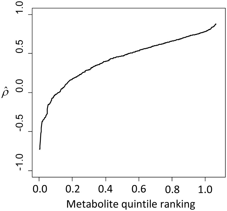
Figure 2. The plot illustrates the distribution of  , an estimate of a measure of autocorrelation over time, for all metabolites.
The curve illustrates that the majority of ρ are likely above 0 and that measurements collected on consecutive days are likely more similar than those collected one week apart. The x-axis indicates the quantile ranking and y-axis indicates  for a metabolite at that ranking. For example, the median level, that of the metabolite ranked 284, is 0.49.

