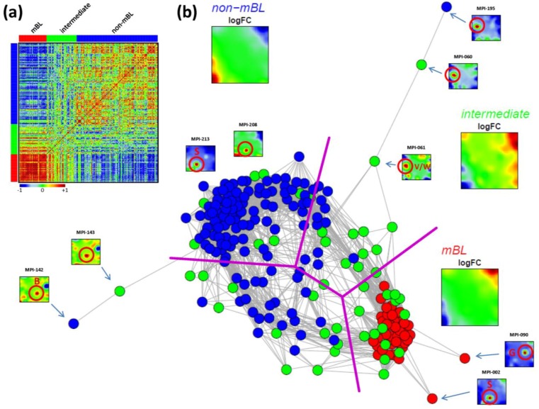
Figure 5.
Pairwise correlation analysis of all lymphoma samples: (a) The pairwise correlation map (PCM) visualizes the correlation coefficients for all pairs of samples. The samples are arranged according to their subtype membership as indicated by the color bars. In the heatmap, red colors indicate positive, blue colors negative correlations between the samples. (b) The correlation network (CN) translates the PCM into a graph structure. The nodes are given by the samples and the edges connect positively correlated sample pairs (r > 0.5). Mean subtype portraits are given within the figure (large maps). Outlier nodes are highlighted by arrows. The SOM portraits of the respective samples are shown by small maps. The red circles and the spot letters indicate the outlier spots differing from the subtype specific patterns (compare these individual sample portraits with the mean subtype portraits).

