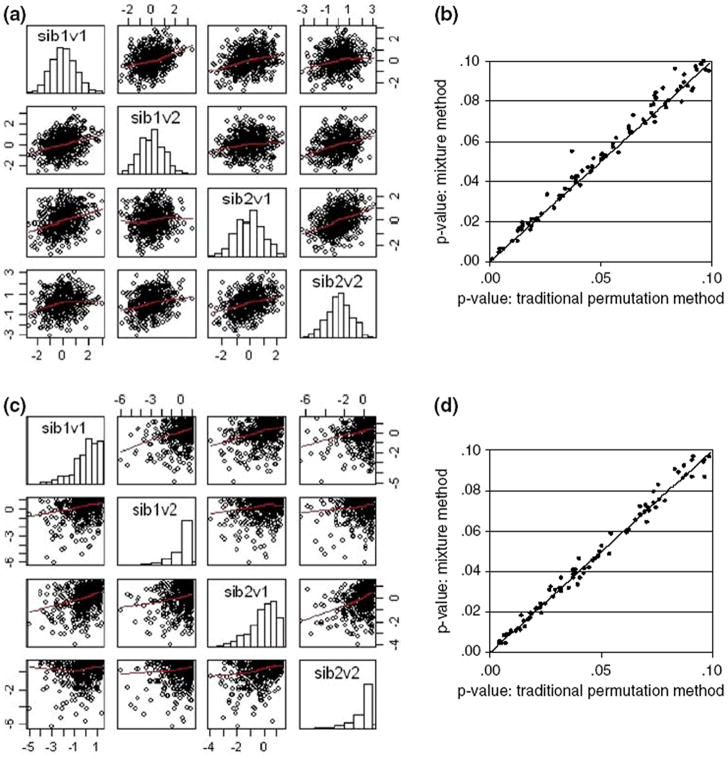
Fig. 3.
Graphical summary of the analyses of the bivariate data sets. Rows: (graphs a and b) 1st results from two normally distributed continuous variables, (graphs c and d) 2nd two highly skewed continuous variables. Columns: left (graphs a and c) The bivariate distribution of the phenotypic values, univariate distributions of each of the phenotypes are summarized using histograms on the diagonal while scatterplots give the bivariate distributions for each pair of traits; (graphs b and d) for P-values <0.1 mixture distribution P-values graphed against empirical P-values from 5,000 permutations/locus (with x = y reference line)

