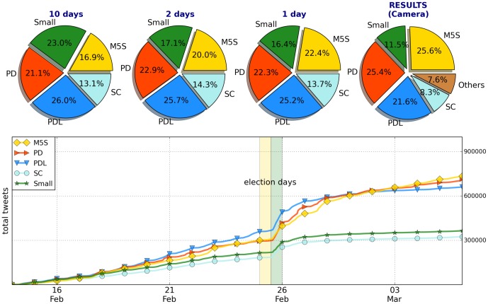
Figure 1. Results of the elections and Twitter volumes.
On top: the pie-chart of the results obtained in the election by the parties. Then the forecast from the Twitter time series frozen at three different final times. Below: the cumulative number of tweets for the various parties and their daily evolution. The yellow and green vertical lines represent the election day and the day after respectively (when exit-polls are released).

