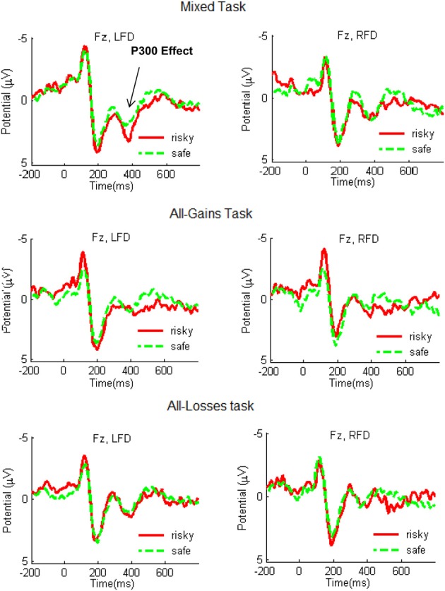
Figure 3.

Grand-average ERP waveforms recorded at electrode site Fz during the Mixed, All-Gains, and All-Losses tasks for the RFD (right column) and LFD groups. The red line shows the average ERP response following outcomes from risky choices and the green dashed line indicates the response following outcomes from safe choices. A stronger P300 response following risky compared to safe outcomes emerged for the LFD group in the Mixed task.
