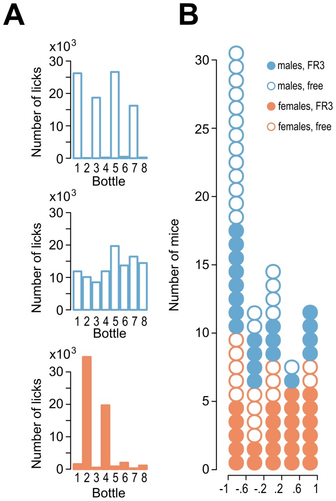
Figure 3. Side-preference bias.
(A) Examples of individual mice that exhibited biased or unbiased side choice. The graphs show the sums of the licks on individual bottles during the intermittent access experiment. The top graph is an example of a mouse with a strong preference for the right side, the middle graph corresponds to an animal without a choice bias and the bottom graph shows an animal with a left side bias and a corner bias. (B) The frequencies of side biases. Each circle on the histogram represents a single animal. Preferences values were calculated as follows: ([right side licks – left side licks]/[right side licks + left side licks]). The summary in panel B includes all mice that were tested for alcohol drinking (40 males and 38 females).

